The Art of Communication Design: Design Each Message
In this 5th & final post of the Art of Communication Design series, we look at how to design each individual message in your comms plan. We'll look at the target audience, channel and goals of your message, and examine ways to reduce the cognitive load (maximise signal, minimise noise).
In this 5th & final post of the Art of Communication Design series, we look at how to design each individual message in your comms plan. Before you read this you might want to read the first couple of posts:
- Part 1: Intro
- Part 2: Define Your Goals
- Part 3: Identify Your Audience
- Part 4: Design Your Comms Plan
Last month I gave this talk at DevRelCon London. This blog post series is a slightly adapted version of my speaker notes, so that it’s split out across multiple posts and hopefully reads better as articles. If you prefer watching videos, check out the talk on the DevRelCon YouTube channel.
In the previous steps, we defined the goal of our comms, we identified our target audience and we designed our comms plan. This final section is about designing each individual message within that comms plan.
Messages can come in all different formats.
You can have messages in text: typically we'll think of things like emails and slack messages, but also consider company newsletters, social media posts, documentation, website banners, pull requests or ticket updates. You can have messages in person and face-to-face: in team meetings, 1:1s or company-wide meetings, and through talks or workshops or events.
Each of these are quite different, and need different approaches. Again it will depend on your context as to which of these formats work best for your comms. I’m not going to be able to talk about every single one here - each of those could be it’s own post (my Art of Slide Design talk goes into detail about how to design your slides effectively. I will be turning the talk into a longer series of blog posts, so stay tuned for that!). But I want to try to touch on some general tips and advice to keep in mind when designing your messaging.
So in the previous step, we designed our comms plan and listed out which individual messages we need to communicate that comms. Now we're taking a closer look at each individual message - what do we need to take into account when designing that message?
Let’s start with specifying what we know about the message so far:
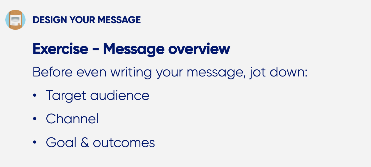
Write down for that specific message the goals that are most important:
- Who is the target audience or audiences?
- What is the channel or format?
- What are the goals or outcomes of the message?
These are all things that you’ve thought of before previously for the overarching comms, now we want to do it specifically for this message. What do you need to get done with this specific message?
The key thing about all of this is ensuring that your comms have the right impact.
To me, this is about reducing cognitive load:
Cognitive load:
the amount of mental activity - perception, memory, problem solving - required to accomplish a goal.
(Universal Principles of Design: Lidwell, Holden & Butler)
So this is the amount of mental activity required to be able to do something. With everything that we do where we need to see something, remember something or solve something, we're using a certain amount of cognitive load. Not every activity will require the same amount of cognitive load though, and it will vary per person as well. For instance, I'm going to spend less cognitive load reading a book from my favourite author compared to reading a long dry historical text, but that might be different for another person.
When we think about design and how to consider cognitive load:
Design should minimise cognitive load to the greatest degree possible.
(Universal Principles of Design: Lidwell, Holden & Butler)
While I've not mentioned this in previous posts, this is exactly what you've been doing with designing your comms plan. You're minimising the cognitive load of coordinating your comms, and reducing the complexity of your context.
So when we're looking at the individual messages, how do you make it easier for your audience to consume your message? How do you reduce that cognitive load?
One good principle to keep in mind here is: maximise signal, minimise noise.
Signal-to-noise ratio:
The ratio of relevant to irrelevant information in a display.
The goal of good design is to maximise signal and minimise noise.
(Universal Principles of Design: Lidwell, Holden & Butler)
This principle comes from the theory of signal to noise ratio. This is the concept that in every type of communication we have there is a certain amount of relevant information to us, the signal, and there’s a certain amount of irrelevant information to us, the noise. With good designs we want to maximise the signal and minimise the noise, ending up with mainly relevant information rather than irrelevant information.
Maximising signal: Focus on key points
How do we maximise signal of your messages? Start by focusing on key points. In the previous exercise, you defined what the goal and outcome of this specific message is, and this should be your main focus. Keep it short, easy to understand and help your audience understand what that key message is.
This will be different per format. The way you focus on something within talks and your slides, is going to be different from when you’re writing a slack message. You need to consider though: are you doing your best to get across what is most important?
One thing you need to reflect on here is what you pulled together in Part 3: Identify Your Audience:
- Audience breakdown: who are your target audiences?
- Audience journey: what impact do you want on your audiences?
- Audience needs: what core needs does your audience have?
Does this specific message need to take these into account? Will your message achieve its goal and outcome given what you know about your audience journey and needs? Or do you need to tweak your messaging in some way? If necessary and appropriate, adapt your key points to take the audience into account in the way to achieve your goals. Reminding yourself of the above, will help you frame your message in the most impactful way.
As an example, let's consider the core needs: remember the example of sunsetting a service? Think about whether your specific message could address any of the core needs that would have been affected. For instance, choice: you might want to highlight how the decision of sunsetting the service had been made to show how people’s input was taken into account or you might want to highlight that there are different options in the future. It's about understanding who your audience and what they need from your key points to understand your messaging.
Minimise noise: Reduce distractions
Next let's look at how do we minimise noise? Now this is about reducing distractions.
To me this is about removing ambiguity, making your message clear and simple and removing anything that is distracting, superfluous and unnecessary.
Think about what words or sentences you’re using that could be interpreted in different ways. If you ask 10 people to each describe what a dog looks like, they’re all going to use different words. So consider whether what you’re saying could be ambiguous and interpreted in another way.
(Special note for ambiguity: In some cases, when applied in a tactical way, ambiguity can actually help get your audience to a desired state. In these cases you're leaving things intentionally ambiguous, so that people will map their own interpretation to what you're saying. This only applies to a certain type of ambiguity and is kind of a power move. What we're trying to do here is reduce unintentional "this-will-lead-to-misinterpretations" ambiguity. If you want to read more about this though, check out Stephen McGarvey's book Ignite a Shift.)
Then think about how to make your message clear and simple. Again what language are you using? Are you using any abbreviations or jargon? Are you using the simplest words that you could. As writers, we often lean towards using big wordy words, but when trying to communicate something to a wide audience, it's often better to keep your language simpler to make things clearer.
Chunk information: Design the flow of information
Another way of focusing on key points, as well as reducing distractions is by chunking information. Group together the information that belongs together and that can be digested together.
Chunking is often used as a memory aid to split out information into more digestable chunks, so people can easier retain that information. Think about the way you memorise a phone number: you'll likely split it out into smaller subsets of numbers to remember.
You can do the same with the information within your messages. Consider what key points belong together and would be better to present together. You need to help your audience with focusing on what is important.
This is all about designing the flow of information in your message. What are your key points? What are your sub-points? And how does the information flow from one point to another?
For instance, let's consider an email about introducing a new 360 feedback tool. Within that email you might split up your content into different sections:
- First, a section explaining what new tool you'll be using, what the key features are and how the company intends to use it.
- Then what went into making the decision of that tool, what considerations were made when looking at the different choices and how the team's feedback about the last tool got taken into account.
- And finally what next steps there will be in the rollout, what actions the person reading the email might need to take, and what further communications about the tool there will be.
There's a lot of pieces of information in there, but by splitting it out into separate sections with similar themes, it becomes easier for the reader to process and digest.
Combining all of the above
Taking the previous sections into account, we now know a couple of different techniques:
- Maximise signal through focusing on the key information
- Minimising noise through reducing distractions and ambiguity
- Chunk information and design your flow of information
How you apply this is going to vary depending on the format, but here are a few ways I would apply the above suggestions myself:
- Use common words, avoid jargon and keep sentences short.
- Use headings and bullet points to provide clarity and structure to your message.
- Consider the flow of information between sections and paragraphs.
For slides:
- Focus on one key message per slide
- Use contrast to highlight information that needs to stand out.
- Keep information that belongs together in the same sections of your talk.
For conversations & meetings:
- Plan out the different parts of topics to discuss.
- Share meeting topics beforehand.
- Checkin with the person/team to see whether they understand what you're saying and clarify your wording if needed.
This is by no means an exhaustive list of ways to apply those lessons. As I mentioned at the start of the article, each of these formats could have their own entire blog post series about how to be more intentional with their design. But I'm hoping this will give a good starting point to reflect on how to apply design to your messaging.
Designing your message
So the next exercise is designing your message:
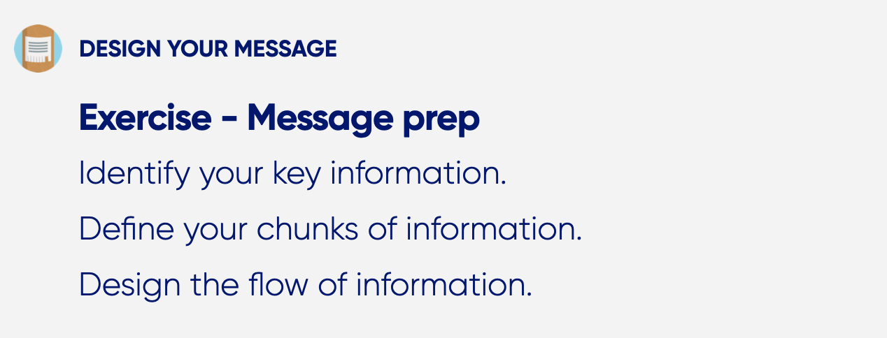
Start with identifying your key information. What does this specific message need to get across to your audience?
Then: define your chunks of information. What information belongs together?
Finally, design the flow of information: how do you want your information to be consumed?
Although we are looking at the individual message, do take time to take a step back and look at how this specific message fits in with the other messages within your entire comms plan. Consider how your message relates to those other messages, and whether there's anything you need to adapt.
For instance, is there anything that is overlapping? Depending on what you're trying to achieve, you might want to repeat some information to make things stick, but in other scenarios you might not want to go over the same information multiple times to avoid duplicating things. It all comes back to that concept of "maximise signal, minimise noise": in some cases repeating information is part of the signal, while for others it's just noise.
Especially when you're staggering information, how does the information need to flow from message to message? What makes a logical continuation? You want to make sure there are no gaps, that you're not missing vital information.
Writing your message
The final exercise is actually writing out the individual message.

So now that you've done your message overview (with target audience, channel and goals & outcome) and the message prep (with key information and flow of information), use that to write out the actual message.
Even when you're delivering the message in person, I would still write out the main key points that you are going to say. This doesn't have to be a full script or anything like that, but it's worth having something a bit more robust to make sure you're covering all the key points. This is also useful when you're using the comms plan to coordinate comms across a team, and helps other team members see what you're planning to say.
Here's a not-well-thought-out example of an email to attendees of a hackathon:
Example:
Hi attendee,
We are exhilarated to welcoming you soon cause it’s only a few more days until Awesome Hackathon, which will occur on September 9th 2023 in the Amazing Event Building. Just a reminder that you will need a printout of our ticket since the building operates on a guest list basis. There will also be security checks and bag checks in place for this. And you need to bring your ID.
Bye,
The Organisers
It’s not a bad email per se, but it’s also not well designed. Reading through it consider: what is the key information? And what are the audience journey and needs?
Now, to me, what is important here is that the event takes place on this date at this location. Next to that, you want people to remember to bring along a print out and an ID. And you don’t want to surprise people, thinking about their needs, about there being security checks and bag checks.
Right now, all that information is in one long paragraph of text. Nothing stands out, so nothing tells me: "this is important information I need to remember". As a reader I require a lot of cognitive load, to be able to parse the information that I need to.
So here's a simple rewrite:
Example:
Hi attendee,
We are so looking forward to seeing you at Awesome Hackathon on September 9th 2023!
Location:
Amazing Event Building [map]
Please bring:
- a printout of your ticket
- your ID
Note: There will also be security checks and bag checks in place on the day.
Bye,
The Organisers
It conveys the same information, but it's designed in a different way. It uses headers and sections to make it really clear what key information you are trying to get across to your audience, making it easier for them to understand what is most important. Next to that, it also uses much simpler language and shorter sentences, making it easier and clearer to read.
Again this is just a made up simple example, but consider all these things when designing your messaging. It's up to you to design the actual messaging and reduce the cognitive load of your audience.
Recap
So those are the 4 steps to designing more intentional comms:
I’m hoping that with these steps you all are more prepared to reflect on your comms and be more deliberate with what you’re communicating.
I want to leave you with one final food for thought: the steps I described I’ve mostly applied in situations where I knew something complex was coming up and I had the time to plan out and design how to do the comms around it.
Sometimes though you don't get that time or you need to be reactive, cause something last minute happened. In those cases, I've had to put a comms plan like this together very rapidly, so that we could coordinate the comms within the team immediately. Especially in those last-minute cases, having a comms plan is extremely valuable.
It's super useful to have had the time earlier to try out these steps and figure out what types of comms plan work for your context. So that when you need something last-minute, you can easily spin up a comms plan template from a previous event.
So: the next time you need to communicate something, even if it’s something small or less complex: remember these steps. Take the time to reflect on what it is you want to say, who to say it to and how to say it, and then design the process around it.
Liked this post? Sign up to my newsletter below to get future blog posts direct in your inbox.
Want to work with me? Get in touch if you want to find out more about engineering management, speaker coaching, outreach and content writing!
This blog post is part of The Art of Communication Design series:
- Part 1: Intro
- Part 2: Define Your Goals
- Part 3: Identify Your Audience
- Part 4: Design Your Comms Plan
- Part 5: Design Each Message
